The design system for
dense, data-heavy
dashboards.
Accessible Figma,
 React and
 Tailwindcomponents
Ship the same tokens, the same component names and the same behaviour in Figma and in code.
npm i @nokgridcore/ui- 69components
- Navigation, forms, tables and charts — every variant named like its React prop.
- 400+tokens
- Colour, type, space and radius, aliased through primitives for Token Studio.
- 5full chart set
- Line, bar, donut, spark and skeleton, with axes, legends and tooltips as real parts.
- 2Light and dark
- One semantic layer, two modes. A new theme is a mode, not a stylesheet.
How it works
One system, from design to code
Decisions are made once in Figma Variables and flow straight into the components you ship.
Colour, type, spacing and radius defined once in Figma Variables and synced to code through Token Studio and Style Dictionary.
Explore tokens (opens in a new tab)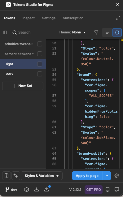
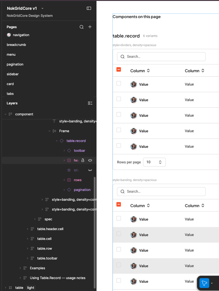
Every component with the same names, properties and states as the code, in light and dark.
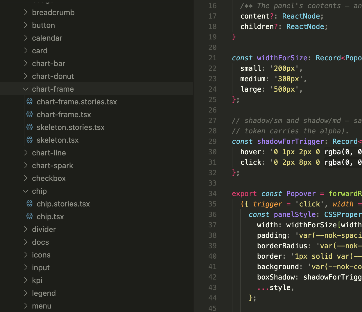
Open in Figma (opens in a new tab)Typed React components that read the tokens. No hardcoded values.
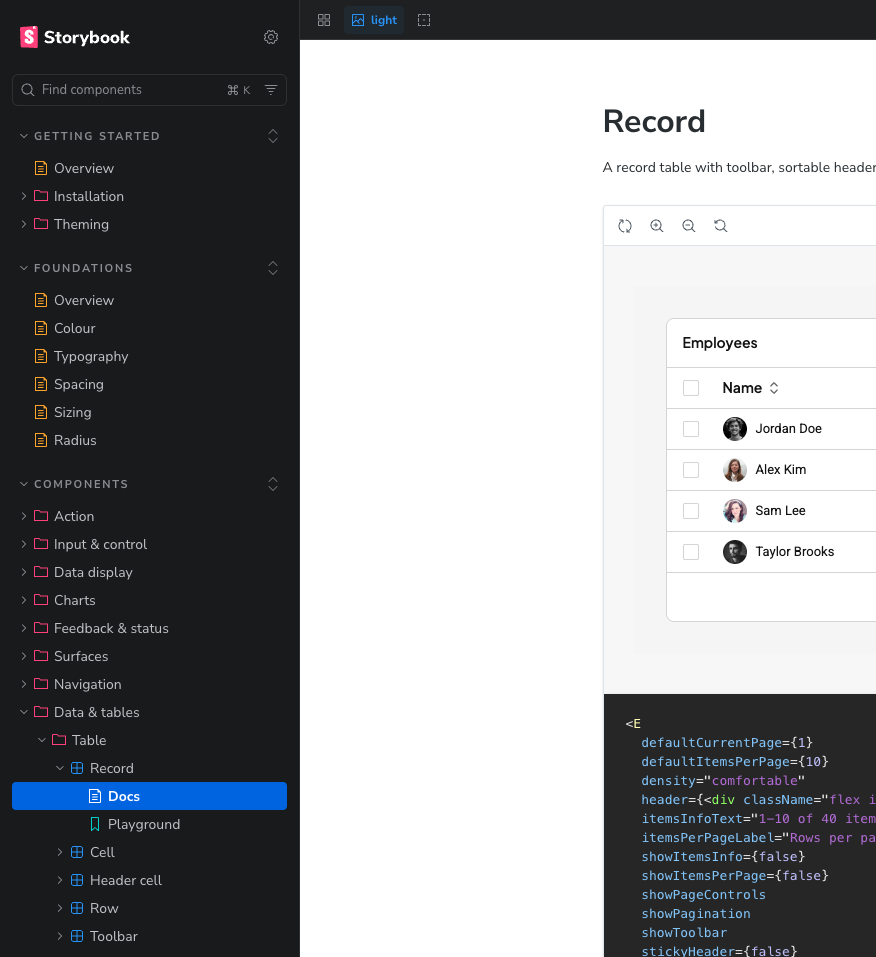
View documentation (opens in a new tab)Every component, variant and state documented in Storybook.
Open in docs (opens in a new tab)
Components
Everything a dashboard needs
Inputs, charts, tables, navigation and feedback, designed for data-heavy screens rather than adapted to them.
Want to see more?
Sixty-nine components cover navigation, forms, tables, charts and overlays.
Built by
Made by a focused small team
Designers and engineers working from one file and one repo, so the system is decided once and shipped once.


Emmanuel Anthony
Design lead
Design systems and dashboards, and the occasional 2am variant audit.

Kelvin
Frontend engineer
React and TypeScript, with strong opinions about token naming.

Timmy
Product designer
Turns dense data into screens people can actually read.
FAQ
Frequently asked questions
Short answers to the things people ask before they install.
Yes. The components, tokens and Figma library are MIT licensed. Use them in commercial products without attribution.
Sixty-nine React components, 400+ design tokens shipped as CSS variables, JavaScript and a Tailwind theme, and the Figma library they are built from.
React 19 and Tailwind CSS 3.4. The tokens are plain CSS variables too, so you can use them without Tailwind.
Yes. Every semantic token has a light and a dark value. Set data-theme="dark" on any element to switch everything inside it.
Yes. @nokgridcore/tokens is its own package, with CSS variables, JavaScript constants and a Tailwind theme.
Tokens live in Figma Variables, are exported with Tokens Studio and built with Style Dictionary, so the library and the code read from the same source.
Yes. Point the brand tokens at your own palette and rebuild. Components only read semantic tokens, so nothing else has to change.
Dense screens need tight spacing, readable small type and charts that share one colour system. The components are sized for that from the start rather than adapted later.
The components are typed, themed and documented in Storybook. Pin your version and check the changelog before upgrading.
Start building
Install the package or open the Figma library.

pnpm add @nokgridcore/ui